
By Llyn L. Strelau
Coloured gemstones have always been my first love—it doesn’t matter if it is a fabulously expensive ruby, sapphire or emerald, a modestly valued tourmaline, or some cool new crystal specimen. What really turns my crank is colour in combination.
The question is, how do you combine colours to create the best effect? Certainly there are personal esthetics; some designers and clients prefer subtle, tone-on-tone looks, while others are entranced by bold, strong contrasting shades they can wear with confidence. Neither is ‘right’ of course, but there is an art to successful blends. At worst, you can always fall back on classic colour theory.
Colour theory
There are abundant resources to learn about colour theory. Sir Isaac Newton developed the first circular representation back in the 1600s. Primary hues: red, blue, and yellow can be mixed to give six secondary hues: green, orange, and purple. These further combine to create tertiary hues and so on. Of course, the gemstones I work with are rarely pure colours. They are typically modified by shade or tint (a component of black or white, respectively), tone (the addition of mixing a hue with neutral grey scale colour), and saturation (a range of pure hue, 100 per cent, to grey, zero per cent, which will change the appearance of a gem from vivid to dull).
Usually, I’ll pull out a collection of coloured gemstones and start playing with them, putting different hues together to see what looks right. However, the ‘rules’ of colour theory are often at play, underneath this more casual approach. Colours adjacent on the wheel are analogous such as violet, blue-violet, and blue. The ring illustrated is a harmonious and subtle blend of three princess-cut sapphires reinforced with square motifs. Typically, one of these gems would be the primary hue with the others serving as accents.


Complementary colours
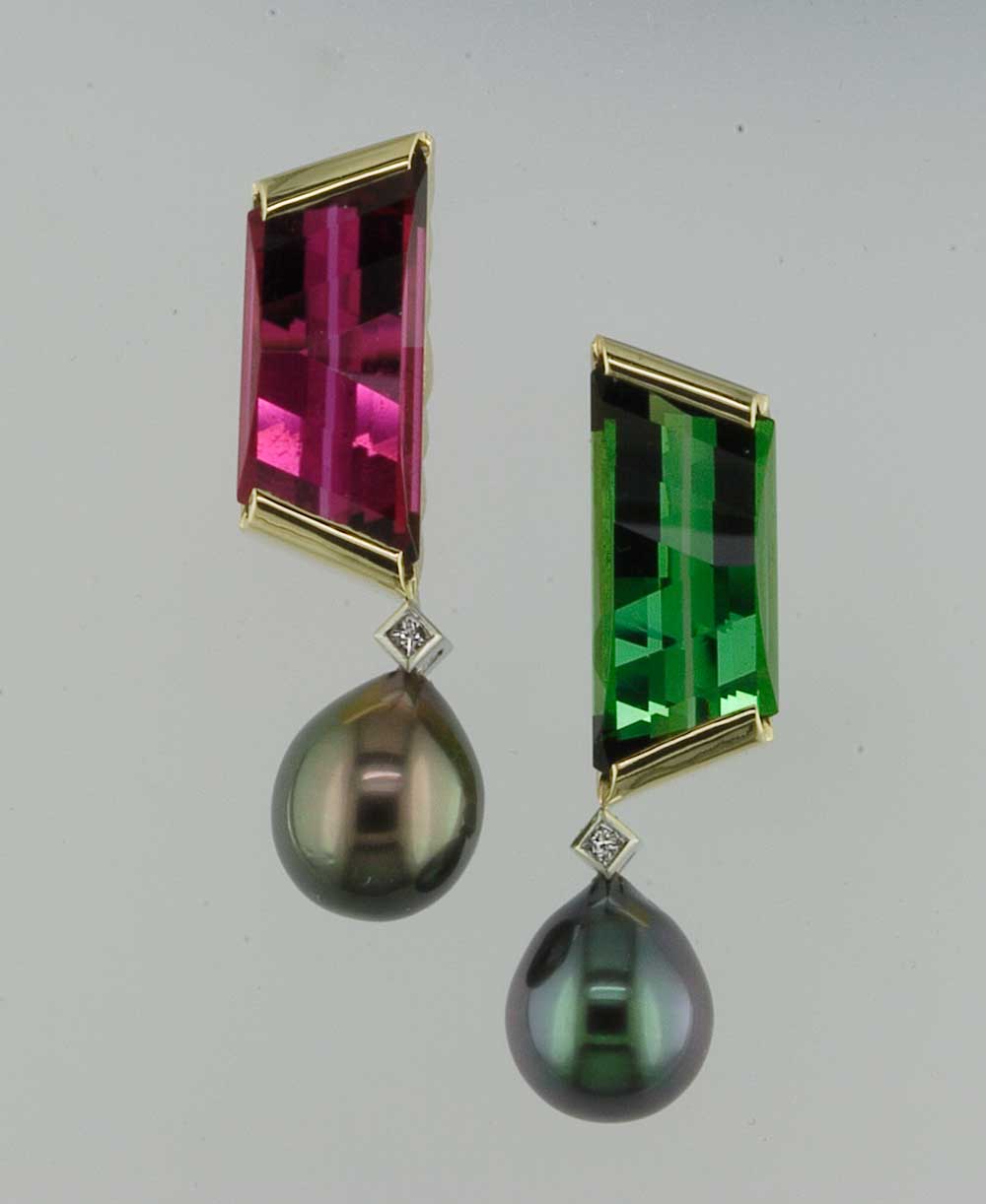
Complementary colours are hues directly opposite on the wheel such as red and green and green-blue and red-orange. Using these colours can create visual stability and contrast.
Nature provides many examples of colours that go well together—some will be reflected in the colour wheel while other combinations don’t, but who could argue with Mother Nature?
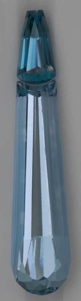
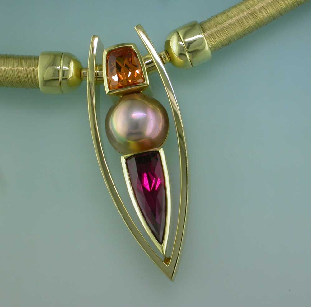
Since few gemstones are actually a pure hue, the degree of grey, brown, or a secondary colour modifying the hue must be considered when paired with other gems. Some gemstones are pleochroic (exhibiting two or more different colours depending on the angle of view). Tanzanite is a prime pleochroic example with blue, purple, and grey all existing together in some gems. Tourmaline also shows this phenomenon, as do many others. There are countless possibilities when you accent a pleochroic gem with one or more of the hues the gem exhibits.


