Colour theory: The art of combining coloured gemstones
Suite knowledge
Browsing a gem supplier’s inventory will often provide inspiration for new designs. Many dealers and cutters have a great eye for colour and will display gems in tempting combinations. I work extensively with the coloured gemstone suites of Colorado’s Stephen Avery, a specialist in this field. He is a true artist and has a brilliant eye for putting colours together.
The finished suites belie the amount of time and consideration going into finding the right hue, saturation, and intensity to create the perfect result. Starting with one of these suites makes my job as a designer easier since the hard work already has been done—imagine the analogous hues of blue zircon paired with tanzanite, a cooler combo with aquamarine, or the vibrancy when zircon is paired with tsavorite garnet.
Mixing mediums
I also like adding pearls to the mix. Since I typically view Avery’s newest collection at the American Gem Trade Association (AGTA) GemFair Tucson, I often walk around with one or more of the suites I’ve purchased and see what various pearl suppliers have that may further enhance the coloured gems. Both South Sea and freshwater pearls, at their best, have a body colour, orient, or overtone. These secondary and tertiary colours can be used in analogous or complementary gem combinations.
This can be as simple as the rose-red and bluish-green tourmaline earrings I designed. The gems were cut as a complementary hued pair, beautiful on their own. I found two South-Sea pearls with a black body colour, but one had a greenish overtone and the other had rose.
The next decision was which gem to pair with which pearl. After going back and forth and discussing it with my client, we decided to keep like-hues together rather than their opposites.
The warm sunset-shades of a slightly muted orange spessartite garnet and a pinkish rubellite tourmaline were the inspiration for a pendant, and finding the perfect Chinese freshwater pearl containing both orange and rose overtones was the final touch. The rich yellow of 18-karat gold is an important component in this design. Any other colour of metal would have been jarring with these gems. Despite being untraditional as per classic colour theory, the combination still works. The more vivid orange of another spessartite is not for the faint of heart, but in following the rules, it pairs beautifully with its complementary colour, the turquoise blue of a very fine indicolite tourmaline.
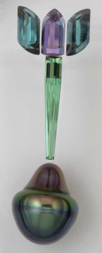
One suite that still remains to see completion contains two indicolite tourmalines flanking a purple scapolite with a needle of green tourmaline. I even found the perfect drop-shaped pearl with blue and green overtones on the bottom transitioning to pinkish purple at the top.
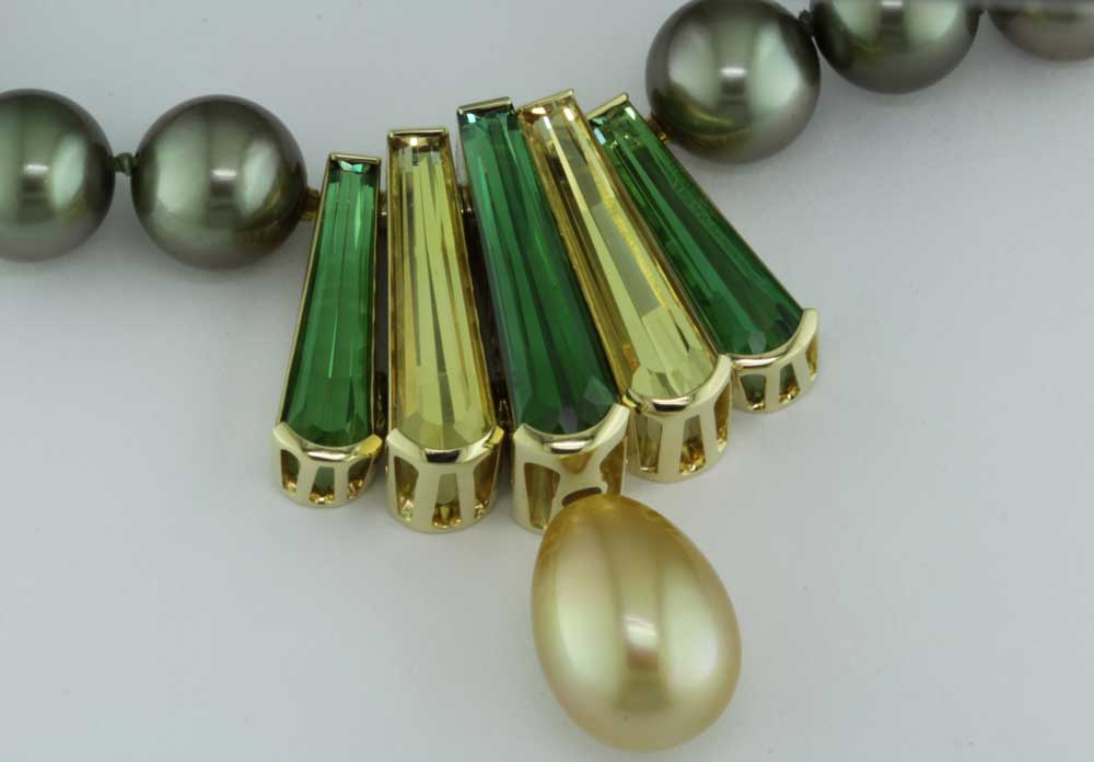
More inspired by nature than formal theory, this suite of tapered, fancy-cut ‘Peacock’ gems came together when I added a beautiful Indonesian South Sea pearl. The green tourmalines and yellow beryl (heliodor) hues were mirrored in the greenish-gold colour of the pearl. It shows well on a gold chain, but even better on a darker South Sea pearl strand with a strong green overtone.
Sign up for our newsletter
Get all the latest news and features from Jewellery Business. Submit your email below to get our twice-monthly newsletter.

Read the Latest Issue
