Colour theory: The art of combining coloured gemstones
Rainbow revamp
One of nature’s great inspirations is the rainbow. However, it takes a certain type of client to wear full-spectrum jewellery. Fortunately, there are a number of gem sources available when putting this range of colours together.
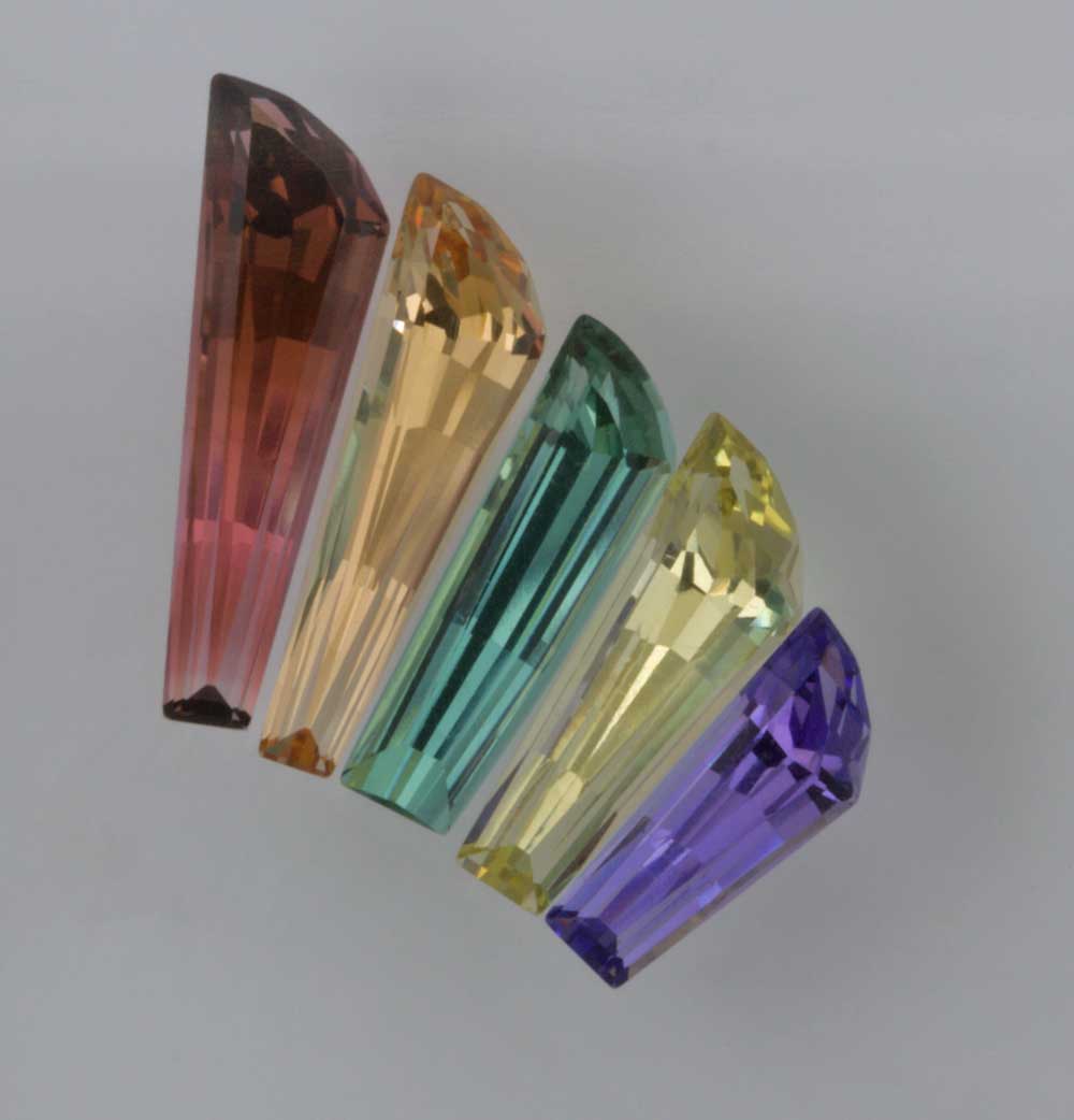
If sticking to single-gem species, tourmaline is the most versatile and available in every colour of the rainbow.
Corundum comes in the full spectrum (albeit, greens are the weakest link generally being on the mossy, yellowish green side of things). While natural yellow and orange are available, most of these corundum colours are improved by either heat or diffusion of beryllium.
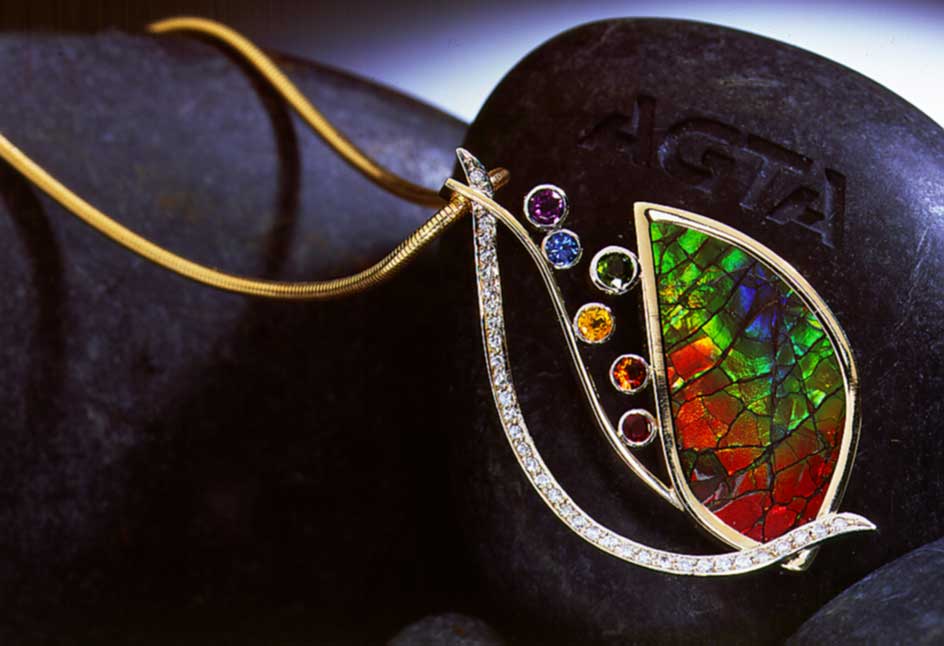
Opal, ammolite and more obscure gems, such as specular or rainbow hematite, can replicate the rainbow all on their own, and it is fun to accent these gems with smaller faceted stones to reinforce the theme.
They can be trickier, however. The red in opal can be pure red, but it’s sometimes slightly modified by pink. Ammolite red is typically true red, but can have an orange modifier. Most rubies have a pink modifier that’s compatible with opal, but it will clash with ammolite. Red spinel or tourmaline will offer the best option required for a true red.
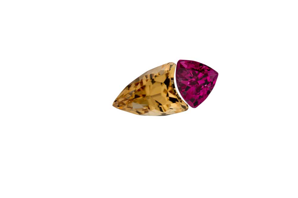
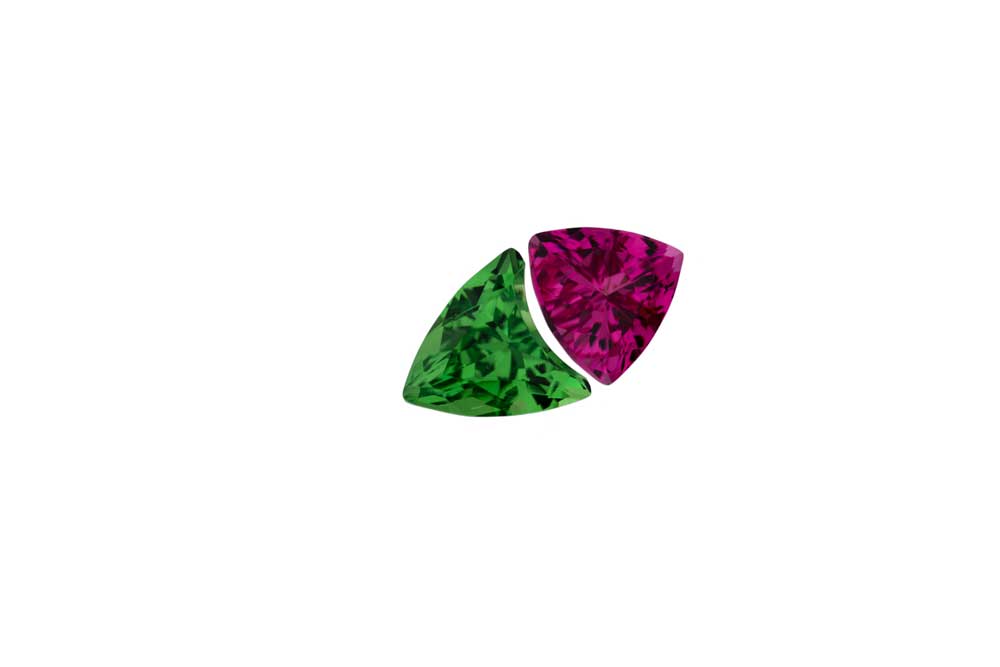
The best way to re-create a rainbow is to choose the best gemstone for each colour: ruby (red spinel), spessartite garnet (citrine, orange sapphire), yellow sapphire (yellow beryl), tsavorite (emerald), blue sapphire, and amethyst (purple sapphire) are some of the available choices.
The whole picture
Another factor to consider when combining colours is not simply where they are located on the colour wheel, but the context of the colours. How a colour behaves in relation to another colour is complex. A strong colour such as red will appear more brilliant against a dark background and dull if surrounded by a paler colour. Experimenting with combinations is the best way to help your decision-making process.
Photos courtesy Stephen Avery
Sign up for our newsletter
Get all the latest news and features from Jewellery Business. Submit your email below to get our twice-monthly newsletter.

Read the Latest Issue
