Colour theory: The art of combining coloured gemstones
by carly_midgley | October 31, 2017 9:29 am
By Llyn L. Strelau
 [1]
[1]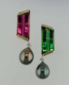 [2]
[2]
Coloured gemstones have always been my first love—it doesn’t matter if it is a fabulously expensive ruby, sapphire or emerald, a modestly valued tourmaline, or some cool new crystal specimen. What really turns my crank is colour in combination.
The question is, how do you combine colours to create the best effect? Certainly there are personal esthetics; some designers and clients prefer subtle, tone-on-tone looks, while others are entranced by bold, strong contrasting shades they can wear with confidence. Neither is ‘right’ of course, but there is an art to successful blends. At worst, you can always fall back on classic colour theory.
Colour theory
There are abundant resources to learn about colour theory. Sir Isaac Newton developed the first circular representation back in the 1600s. Primary hues: red, blue, and yellow can be mixed to give six secondary hues: green, orange, and purple. These further combine to create tertiary hues and so on. Of course, the gemstones I work with are rarely pure colours. They are typically modified by shade or tint (a component of black or white, respectively), tone (the addition of mixing a hue with neutral grey scale colour), and saturation (a range of pure hue, 100 per cent, to grey, zero per cent, which will change the appearance of a gem from vivid to dull).
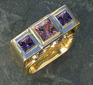
Usually, I’ll pull out a collection of coloured gemstones and start playing with them, putting different hues together to see what looks right. However, the ‘rules’ of colour theory are often at play, underneath this more casual approach. Colours adjacent on the wheel are analogous such as violet, blue-violet, and blue. The ring illustrated is a harmonious and subtle blend of three princess-cut sapphires reinforced with square motifs. Typically, one of these gems would be the primary hue with the others serving as accents.


Complementary colours
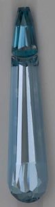
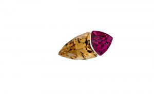
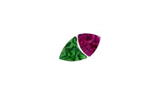
 [3]
[3]Complementary colours are hues directly opposite on the wheel such as red and green and green-blue and red-orange. Using these colours can create visual stability and contrast.
Nature provides many examples of colours that go well together—some will be reflected in the colour wheel while other combinations don’t, but who could argue with Mother Nature?
Since few gemstones are actually a pure hue, the degree of grey, brown, or a secondary colour modifying the hue must be considered when paired with other gems. Some gemstones are pleochroic (exhibiting two or more different colours depending on the angle of view). Tanzanite is a prime pleochroic example with blue, purple, and grey all existing together in some gems. Tourmaline also shows this phenomenon, as do many others. There are countless possibilities when you accent a pleochroic gem with one or more of the hues the gem exhibits.
Suite knowledge
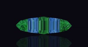
 [4]
[4]Browsing a gem supplier’s inventory will often provide inspiration for new designs. Many dealers and cutters have a great eye for colour and will display gems in tempting combinations. I work extensively with the coloured gemstone suites of Colorado’s Stephen Avery, a specialist in this field. He is a true artist and has a brilliant eye for putting colours together.
The finished suites belie the amount of time and consideration going into finding the right hue, saturation, and intensity to create the perfect result. Starting with one of these suites makes my job as a designer easier since the hard work already has been done—imagine the analogous hues of blue zircon paired with tanzanite, a cooler combo with aquamarine, or the vibrancy when zircon is paired with tsavorite garnet.
Mixing mediums
I also like adding pearls to the mix. Since I typically view Avery’s newest collection at the American Gem Trade Association (AGTA) GemFair Tucson, I often walk around with one or more of the suites I’ve purchased and see what various pearl suppliers have that may further enhance the coloured gems. Both South Sea and freshwater pearls, at their best, have a body colour, orient, or overtone. These secondary and tertiary colours can be used in analogous or complementary gem combinations.
 [5]
[5]This can be as simple as the rose-red and bluish-green tourmaline earrings I designed. The gems were cut as a complementary hued pair, beautiful on their own. I found two South-Sea pearls with a black body colour, but one had a greenish overtone and the other had rose.
The next decision was which gem to pair with which pearl. After going back and forth and discussing it with my client, we decided to keep like-hues together rather than their opposites.
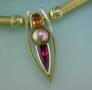
The warm sunset-shades of a slightly muted orange spessartite garnet and a pinkish rubellite tourmaline were the inspiration for a pendant, and finding the perfect Chinese freshwater pearl containing both orange and rose overtones was the final touch. The rich yellow of 18-karat gold is an important component in this design. Any other colour of metal would have been jarring with these gems. Despite being untraditional as per classic colour theory, the combination still works. The more vivid orange of another spessartite is not for the faint of heart, but in following the rules, it pairs beautifully with its complementary colour, the turquoise blue of a very fine indicolite tourmaline.
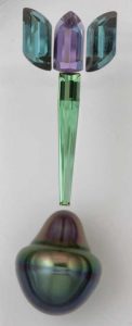
One suite that still remains to see completion contains two indicolite tourmalines flanking a purple scapolite with a needle of green tourmaline. I even found the perfect drop-shaped pearl with blue and green overtones on the bottom transitioning to pinkish purple at the top.
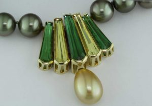
More inspired by nature than formal theory, this suite of tapered, fancy-cut ‘Peacock’ gems came together when I added a beautiful Indonesian South Sea pearl. The green tourmalines and yellow beryl (heliodor) hues were mirrored in the greenish-gold colour of the pearl. It shows well on a gold chain, but even better on a darker South Sea pearl strand with a strong green overtone.
 [6]
[6]Rainbow revamp
 [7]
[7]One of nature’s great inspirations is the rainbow. However, it takes a certain type of client to wear full-spectrum jewellery. Fortunately, there are a number of gem sources available when putting this range of colours together.
If sticking to single-gem species, tourmaline is the most versatile and available in every colour of the rainbow.
Corundum comes in the full spectrum (albeit, greens are the weakest link generally being on the mossy, yellowish green side of things). While natural yellow and orange are available, most of these corundum colours are improved by either heat or diffusion of beryllium.
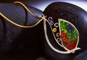
Opal, ammolite and more obscure gems, such as specular or rainbow hematite, can replicate the rainbow all on their own, and it is fun to accent these gems with smaller faceted stones to reinforce the theme.
They can be trickier, however. The red in opal can be pure red, but it’s sometimes slightly modified by pink. Ammolite red is typically true red, but can have an orange modifier. Most rubies have a pink modifier that’s compatible with opal, but it will clash with ammolite. Red spinel or tourmaline will offer the best option required for a true red.
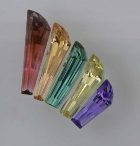
 [8]
[8]The best way to re-create a rainbow is to choose the best gemstone for each colour: ruby (red spinel), spessartite garnet (citrine, orange sapphire), yellow sapphire (yellow beryl), tsavorite (emerald), blue sapphire, and amethyst (purple sapphire) are some of the available choices.
The whole picture
Another factor to consider when combining colours is not simply where they are located on the colour wheel, but the context of the colours. How a colour behaves in relation to another colour is complex. A strong colour such as red will appear more brilliant against a dark background and dull if surrounded by a paler colour. Experimenting with combinations is the best way to help your decision-making process.
 [9]
[9]Photos courtesy Stephen Avery
 [10]
[10]
A personal touch
 [11]
[11]Photo courtesy Stephen Avery
In addition to other qualities, colours have a temperature. Warmer hues, reflective of daylight or sunsets, are red through yellow and include browns and tan. Cooler colours visualized as overcast or grey days are green through blue and violet.
While hardly foolproof, the trend in past years has been for individuals to have their colours ‘researched’ by a fashion consultant. This concept does have merit. Whether you wish to identify a client’s colour season or simply observe what particular colours or combinations ‘pop’ when wearing coloured gemstones, it is useful to make an observation.
A cool blue-red, such as ruby, is quite different from the warmer orange-based red of some garnets or red spinel. Similarly, yellowish greens will be warmer than icy blue-green hues. This factor is of great help in creating a piece of custom jewellery perfect for an individual client.
 [12]
[12]Set the stone
The colour of metal used for setting stones plays an important role in the finished jewellery. In many cases, the metal colour is more a of a client preference e.g. someone may prefer yellow over white metal on their skin, or vice-versa.
Personally, I prefer most rubies and other red gems in warmer-toned yellow or rose gold, and cooler gemstone colours in white metal. That being said, it is hard to discount the beauty of a royal blue sapphire set in rich deep yellow gold.
Using more than one colour of gold in a piece can work well, too. Generally, more pastel tones will show better in neutral white metal, while more saturated colours can shine with yellow or red gold.
Designers are privileged to work with a range of coloured gems, which provide the entire spectrum and offer an endless scope for creative design. Put more colour in your life! Whether subtle, soothing pastels or vibrant exciting primary hues, there is a colour combination to suit every project.
 [13]Llyn L. Strelau is the owner of Jewels by Design in Calgary. Established in 1984, his by-appointment atelier specializes in custom jewellery design for local and international clientele. Strelau has received numerous design awards, including the American Gem Trade Association’s (AGTA’s) Spectrum Awards and De Beers’ Beyond Tradition—A Celebration of Canadian Craft. His work has also been published in Masters: Gemstones, Major Works by Leading Jewelers. Strelau can be reached via e-mail at designer@jewelsbydesign.com.
- [Image]: https://www.jewellerybusiness.com/wp-content/uploads/2017/10/avery-aquamarine-zircon-sui.jpg
- [Image]: https://www.jewellerybusiness.com/wp-content/uploads/2017/10/Contrasts.jpg
- [Image]: https://www.jewellerybusiness.com/wp-content/uploads/2017/10/Autumn-Equinox.jpg
- [Image]: https://www.jewellerybusiness.com/wp-content/uploads/2017/10/JBD578.jpg
- [Image]: https://www.jewellerybusiness.com/wp-content/uploads/2017/10/avery-tulip-suite-with-comp.jpg
- [Image]: https://www.jewellerybusiness.com/wp-content/uploads/2017/10/Mi-Tierra.jpg
- [Image]: https://www.jewellerybusiness.com/wp-content/uploads/2017/10/avery-wind-series-II.jpg
- [Image]: https://www.jewellerybusiness.com/wp-content/uploads/2017/10/Under-the-Rainbow.jpg
- [Image]: https://www.jewellerybusiness.com/wp-content/uploads/2017/10/Spinel-0.84ct-Topaz-1.81ct.jpg
- [Image]: https://www.jewellerybusiness.com/wp-content/uploads/2017/10/Spinel-0.73ct-Tsavorite-0.8.jpg
- [Image]: https://www.jewellerybusiness.com/wp-content/uploads/2017/10/avery-blue-green-suite.jpg
- [Image]: https://www.jewellerybusiness.com/wp-content/uploads/2017/10/Opening-Night.jpg
- [Image]: https://www.jewellerybusiness.com/wp-content/uploads/2017/10/JBD-Llyn-Strelau-Portrait-5-x-5.jpg
Source URL: https://www.jewellerybusiness.com/features/colour-theory-art-combining-coloured-gemstones/