Interpretation of colour
by Samantha Ashenhurst | March 26, 2021 1:10 pm
By Bénédicte Lavoie
 [1]
[1]Colour is an integral part of life. It surrounds us from dawn ‘till dusk; whether you’re crossing the street at a green light, looking up at the sky to predict the weather, watching a sunset, or simply decorating a home, colour is everywhere you look! These shades and hues stir up emotions and help us express ourselves. In jewellery, coloured gemstones spark curiosity and passion. What would life be without colour?
One of the most fascinating aspects of colour is its dependency on one single thing: light. Without light, colour would not exist, as it is light frequency our eyes and brain interpret as distinct colours.
‘Light frequency’ describes the number of waves per second. The human eye detects wavelengths of 400 nm (purple) up to 700 nm (red) on the electromagnetic spectrum. These wavelengths correspond to the visible spectrum.
Seeing a colour is the result of light being transformed by a material. In the case of gems, selective absorption of light often dictates its colour. The material contains different trace elements and absorbs some or all of the wavelengths. The residual energy is then translated by the brain and the colour is interpreted.
 [2]
[2]It’s not difficult to perceive a colour; however, communicating a colour poses a much greater challenge. There are the basic primary colours (i.e. blue, red, and yellow), and we can transform these by adding an adjective (i.e. dark blue, bright red, or pale yellow). Likewise, when being specific, sometimes it’s easier to refer to certain objects (think: ‘lemon yellow,’ ‘lime green,’ or ‘cherry red’) when describing a colour. This little trick helps our brain instantly envision a specific shade.
In jewellery, a stone’s origin is often used to describe its colour, like Thai sapphires, Muzo emeralds, Burmese rubies, and Paraiba tourmalines.
Some colours are perceived differently from person to person. Often, these are a mix of colours—teal, for instance, is a mixture of blue or green, and peach, which is a mixture of pink and yellow.
But does teal have more blue or green? Is peach more pink or yellow? Does lavender contain more purple or blue?
This author recently posed questions such as these to more than 3000 gemstone-lovers on Instagram, presenting participants with a range of gemstones that are often described as ‘peach,’ ‘teal,’ or ‘lavender’ in colour. (To participate in this survey, visit Instagram.com/pierres.de.charme[3] and click the ‘Colour Quiz’ story.) She then reached out to Toronto-based colour expert and Jewellery Business contributor, Katinka Champion[4], to help interpret the survey’s results.
Peach
While peach consists of yellow, orange, and, often, pink, several factors should be taken into account in the perception of this colour.
“As one’s eyes age, they can develop a yellow filtering effect on one’s vision,” Champion explains. “So, depending on what stage of life you are in, you might view a yellow-orange colour to be more yellow than it truly is. If your eyes perceive more yellow in a peach hue, it makes the colour appear less ‘peachy.’ All these nuances need to be kept in mind when judging colour, or when requesting a ‘peach’ coloured gem for a customer.”
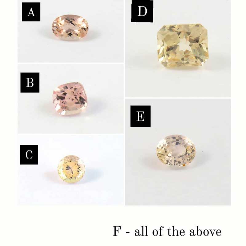
When blindly presented with five sapphire and morganite options (Figure 1), 63 per cent of respondents identified a morganite (gemstone ‘A’) as most closely matching the colour peach. It is interesting to note that sapphire (gemstone ‘B’) received 22.5 per cent of the votes, while 12.5 per cent said both stones best described the colour equally. Thus, more than 97 per cent of votes went to these two options—most people consider the peach colour to contain a significant amount of pink! Sapphires, morganites, spinels, Malaya garnets, and some imperial topazes, are all good examples of durable stones in this shade.
Teal
In French, ‘teal’ is called bleu canard or sarcelle. This is reference to the mixture of green and blue reflections often seen on a duck’s neck. Indeed, this is a nuanced mix rather than one set colour.
 [5]
[5]“To define the colour teal more accurately, one should probably accompany the hue with a modifier like ‘blue’ or ‘green,’” Champion says. “Most people have a preconceived colour in their mind of what teal should look like to them. This [perception], in their mind’s eye, is likely based on their life experience with this elusive colour.”
Certain moments in our lives, Champion explains, can shape one’s perception of a colour. For example, if a young girl buys a dress a salesperson has described as ‘teal,’ the child will likely keep the exact shade of the garment in mind as her understanding of the colour; this experience planted a seed and unconsciously created a memory link to the exact shade.
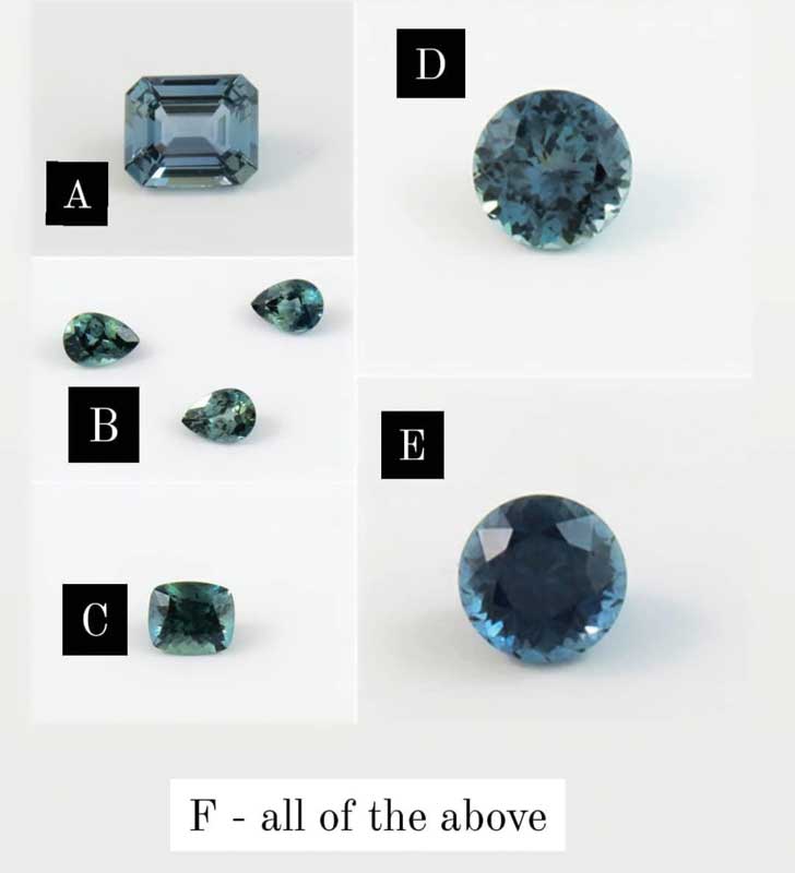
For this author’s poll, all of the ‘teal’ options were either Montana or Australian sapphires (Figure 2). The responses for which best resembled the colour were largely split:
- gemstone ‘C’ (Montana sapphire)—24 per cent;
- gemstone ‘D’ (Montana sapphire)—20 per cent;
- gemstone ‘B’ (Australian sapphire)—17 per cent; and
- gemstone ‘F’ (‘all of the above’)—15 per cent.
Gemstones ‘E’ (Montana sapphire) and ‘A’ (Madagascar sapphire), however, garnered few votes, taking only four and 1.5 per cent, respectively.
Overall, Montana and Australian sapphires represent the colour teal most accurately of all gemstones; their blue, yellow, and green sections create reflections reminiscent of those seen on ducks, as referred to in French.
Lavender
Similar to teal, lavender is very subjective.
“It is difficult to capture all the floral subtleties in one perceived hue,” Champion explains. “Lavender’s light purple tint can range from a very pale pastel, to more saturated ‘floral lavender’ with a hint of pink or blue in either version.
 [6]
[6]“Lavender tanzanite, sapphire, and spinel all can reflect these captivating hues back at the viewer.’’
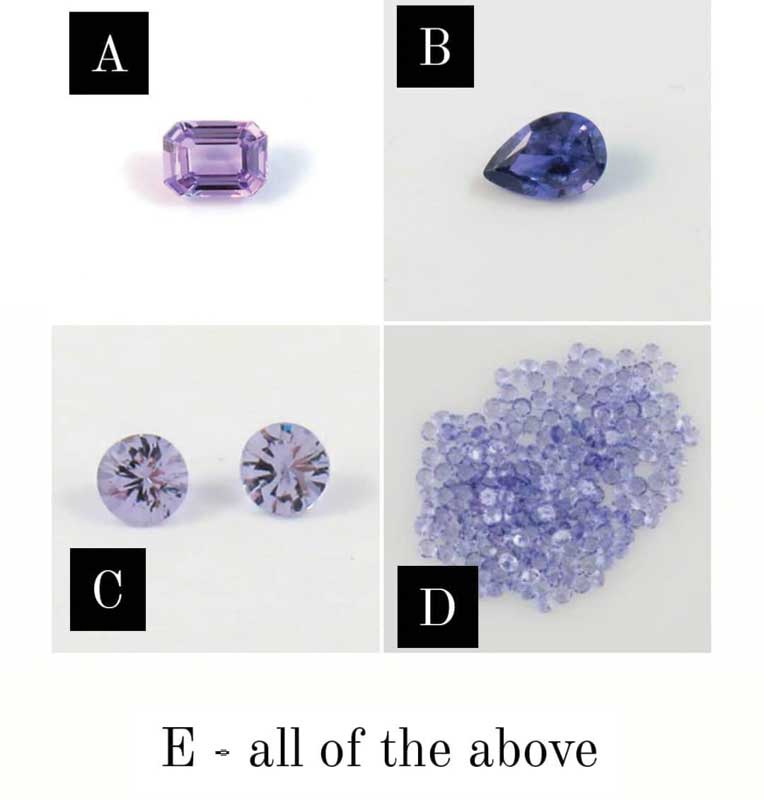
Indeed, for this poll, gemstones ‘C’ (spinel) and ‘D’ (light tanzanite) took in 33 per cent and 31.5 per cent of the votes, respectively, while the combination of ‘C’ and ‘D’ earned 11.5 per cent (Figure 3). Thus, it’s safe to say the vast majority of respondents feel these two pastel shades are most representative of lavender. (Gemstones ‘B’ and ‘F’ received only 1.27 per cent of votes each.)
How to communicate colours
How can a colour be described over the phone or via email? There are several gradation systems to help jewellers communicate colours; however, it is essential those involved use the same system—and this doesn’t often happen!
At one point, the Gemological Institute of America (GIA) offered a tool called Gem Set: an arrangement of coloured ‘spoons’ representing 324 colours of stones. Stone traders could use this when communicating with colleagues around the world to share references of desired colours. Unfortunately, this system has not been produced since the early 2000s and is now rarely used. It’s since been replaced by another tool, called Gemewizard, which allows the communication of more than 1000 colours. Of course, the flaw with this system is that it’s online and not all computer monitors are calibrated the same, causing difference in colour! Other systems, such as World of Colours, are also used by appraisers.
Alas, it will always be challenging to describe a coloured gemstone, as it reflects a mix of hues. These stones are best described by their base colour, saturation, and tint (e.g. ‘a light greyish blue’ or ‘a very saturated orangey yellow’). The wonderful thing about the world of coloured gemstones is you can always find one that will match the colour and shade you want!
Bénédicte Lavoie, FGA, is co-owner and vice-president of Pierres de Charme[7] and specializes in fine coloured gemstones. She joined the family business after completing a bachelor’s degree in business and human resources (HR) management and was awarded the internationally recognized title of Fellow of the Gemological Association of Great Britain (FGA–Merit). Based in Montréal, Pierres de Charme supplies fine gemstones to jewellers, goldsmiths, and award-winning artists across Canada and the United States. Lavoie can be reached via email at info@pdcgems.com[8].
- [Image]: https://www.jewellerybusiness.com/wp-content/uploads/2021/03/7.jpg
- [Image]: https://www.jewellerybusiness.com/wp-content/uploads/2021/03/Peach.jpg
- Instagram.com/pierres.de.charme: http://Instagram.com/pierres.de.charme
- Katinka Champion: http://jewellerybusiness.com/features/2021-forecast-colour-palette-coloured-gems-to-look-for-in-the-new-decade
- [Image]: https://www.jewellerybusiness.com/wp-content/uploads/2021/03/Teal.jpg
- [Image]: https://www.jewellerybusiness.com/wp-content/uploads/2021/03/Lavender.jpg
- Pierres de Charme: http://pierresdecharme.com/en/index.snc
- info@pdcgems.com: mailto:info@pdcgems.com
Source URL: https://www.jewellerybusiness.com/features/interpretation-of-colour/