Seeing red (and blue and green): Colour perception and light(ing)
by charlene_voisin | May 1, 2014 9:00 am
By Mark T. Cartwright
 [1]
[1]
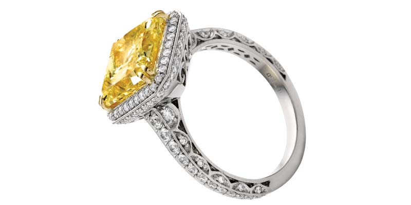
The vivid yellow of this diamond is only in your mind…literally. Colours are a significant part of our experience as humans and a huge part of what we do as professional gemmologists and appraisers. We describe hue, tone and saturation, overtone, brightness, and intensity, and we hope those relying on our observations and words can or will interpret them correctly. However, verbiage aside, what do we actually understand about colour and the factors affecting how we perceive it? I’m not an expert by any stretch of the imagination, but my investigations of this subject have provided me with a much greater appreciation of the complexity of what I’d once believed should be a simple process: create an environment to accurately see and describe colour.
Picture it
 [2]
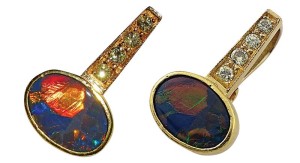
[2]There are three basic components involved in seeing colour: the object, the perceiver, and the lighting environment. These three interact with each other in unique and idiosyncratic ways. Objects absorb, reflect, or in some cases, emit certain wavelengths of light. Humans rely primarily on brain function to interpret the stimuli received by the receptors in the eyes. The two primary theories attempting to explain colour vision suggest there are three regions of the spectrum observed (i.e. red, green, and blue) or two opposing pairs (i.e. red”“green, blue”“yellow). Every other colour we ‘see’ is generated by our brain and is the result of the interpretation of the relative intensities of those wavelengths. Obviously, that’s a gross oversimplification of a very complex subject, but it certainly offers food for thought. Our brains rely on subtle differences in the reflectivity and absorption of those narrow portions of the spectrum to interpret and ‘create’ millions of colours; those subtle differences are entirely dependent on the lighting environment.
 [3]
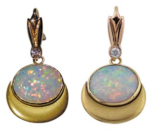
[3]We work in an artificial lighting environment and it’s important we understand how it influences what we see. I’ve always been told the ‘ideal’ light under which to examine gemstones was ‘daylight’ or its ‘equivalent.’ But what exactly is daylight equivalent and who decided that? The quality of light as it relates to human colour perception can be described using concepts developed by the Commission Internationale de l’Eclairage (CIE). CIE has defined a variety of terms used to describe both daylight and artificial lighting, including daylight equivalent standards (D50, D55, D65, and D75). Whether we’re using a small grading ‘box’ or working in an open office, the quality of the light influences how we see colours. Additional terminology developed by other scientists is used to describe the other aspects of lighting in a workspace, such as relative brightness. Gaining familiarity with these terms and the ideas they represent can help us create our grading environment and recognize its inherent weaknesses.
There are several lighting components to consider, such as brightness, evenness, colour temperature, colour rendering, spectral power distribution, consistency, and cost. As we consider these factors each in turn, keep the specific purpose of your lighting environment in mind. Are you trying to colour grade diamonds exclusively? Grade diamonds for colour and cut? Describe and grade coloured gems exclusively? Will you try to create an environment for both coloured gems and diamonds? Are you hoping to make gemstones and jewellery look their best in a showcase? Are you trying to document them accurately with a film camera or will you use a digital camera? As I’ve discovered, the phrase ‘jack of all trades, master of none’ seems to accurately apply to lighting.
What? No, watt
 [4]
[4]Before the advent of fluorescent tubes, halogen, metal halide, and light emitting diodes (LEDs), most people associated the brightness of a light source with the term ‘watt.’ In fact, all that metric describes is the amount of electricity used by a bulb per hour of operation. When most of us used incandescent bulbs, it was a safe bet a higher-wattage bulb would be brighter and as a result, some of us still associate the term watt with brightness. The reality is that for anything other than a standard incandescent bulb, we shouldn’t even be looking at the wattage of a light source except that it allows us to compare the cost per hour of operation. Before there were incandescent bulbs, there were candles and one of the earliest standardized measurements of brightness was the ‘foot-candle.’
Foot-candle is still sometimes used to describe the brightness of an illuminant or the general brightness on a surface or in a room. As implied by the name, it is defined as the amount of illumination on the inside surface of a sphere with a one-foot radius from a one-candela light source. When originally defined in the 19th century, the size and type of candle was carefully defined—and then promptly disagreed upon. The term has somewhat fallen out of favour and been supplanted by ‘lumen’ and ‘candela,’ the latter of which is the theoretical brightness of one candle viewed from one foot away. A millicandela is, as the prefix would suggest, one-thousandths of a candela and it’s not unusual for the brightness of a light emitting diode (LED) to be expressed in millicandelas, abbreviated as ‘mcd.’ A lumen can be thought of as a measure of the amount of visible light energy in a specifically defined beam or angle. Since a lumen considers only that part of the spectrum visible to humans, it can provide useful, though, somewhat incomplete information. For instance, the amount of ultraviolet produced by a light source is not measured in lumens; knowing the lumen output offers no indication of how accurately it renders colours.
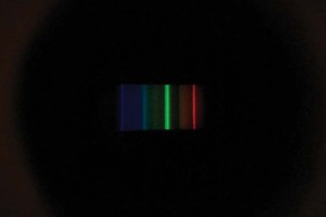 [5]
[5]Colour Rendering Index (CRI) is one of the metrics CIE created as a means of comparing the ability of an illuminant to render a specific group of 10 standardized colours compared to an ideal light source. A CRI of 100 would be a perfect match to the reference illuminant. CRI is only meaningful when comparing similar types of light sources.
For instance, a fluorescent lamp with a CRI of 90 renders colour better than a fluorescent lamp with a CRI of 80; however, it doesn’t indicate whether or not it renders colour better than an LED with a CRI of 85. In addition, for CRI comparisons to be meaningful, the illuminants need to have the same Correlated Colour Temperature (CCT) when the CCT is less than 5000K.
If an illuminant has a CCT of 5000K or higher, the comparison is based on one of the CIE ‘D’ standard illuminants that represent an idealized daylight environment. CIE D50 represents morning horizon daylight, CIE D55 represents mid-morning daylight, CIE D65 represents average noon north daylight, and CIE D75 represents north daylight. CCT is a measurement of the apparent colour of the light source and is expressed in degrees Kelvin. Based on a theoretical ‘radiating blackbody,’ the idea is much like the appearance of a torch flame; as it gets ‘hotter,’ the colour changes from yellowish to blue. This gives rise to the idea of a ‘warm light’ or a ‘cool light.’ For most of our applications, lighting at or above CCT 5500K is most useful; the lighting typically used for colour grading diamonds is in the range of CCT 6400K to CCT 6700K. However, correlated colour temperature and colour rendering index still aren’t the whole story.
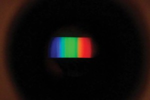 [6]
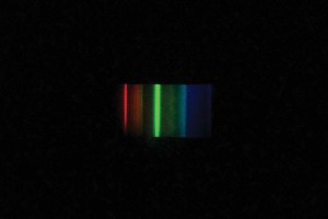
[6]In order for an object to accurately reflect a colour, it must be present in the spectrum of the light source. This gives rise to the concept of Spectral Power Distribution (SPD). As the name suggests, SPD measures the relative strength of the various wavelengths in a light source. In general, since incandescent lights are, in effect, blackbody radiators, they contain the full spectrum and typically exhibit a relatively continuous SPD, although stronger in red, orange, and yellow. That may be why an incandescent light is considered to be the preferred lighting environment for grading opals. It’s in this area that fluorescent lighting falls short as the phosphors tend to have distinct ‘spikes,’ rather than the preferred continuous SPD curve. However, as we know from living with incandescent lighting, having a complete spectrum available doesn’t mean that colours are rendered accurately. One can use a handheld spectroscope to get a visual idea of a light’s SPD.
Seeing the light
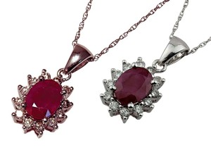 [7]
[7]So what is the perfect light source? There isn’t a single answer and we must return to the question of what you’re trying to do. The latest generation of LED lighting has made significant gains in CRI, SPD, and higher daylight colour temperatures. More importantly, the prices are coming down dramatically. However, mass manufacturing techniques cause inconsistency between individual diodes and, as with everything else, there’s no free lunch.
Inexpensive LEDs are not a bargain; high-quality, consistent lighting requires carefully selected LEDs manufactured under precise quality control. Fluorescent lighting is still pretty much the ‘standard’ for many grading purposes in spite of its obvious SPD limitations, although there are high CRI, high CCT specialty fluorescent tubes with seven phosphors rather than the standard two or three, which significantly improve SPD. Incandescent lighting is quickly becoming obsolete, even though it can be a good illuminant for rendering some colours. My current (and ongoing) research has led me to an illuminant with a good balance of features. It is a new generation of LED that is rated at 5000K and 95 CRI, with a virtually flat SPD. I haven’t yet tried it in my lab, but aside from being at the low end of ‘daylight’ CCT, it ‘looks good on paper.’
Regardless of the lighting you choose for your lab, it’s important you understand its strengths and its weaknesses in rendering colour accurately and that you let users of your report know the illuminant you used to determine the colour you perceived.
 [8]Mark T. Cartwright, ASA, ICGA, CSM-NAJA, GG (GIA), is president of The Gem Lab, I.C.G.A., an independent American Gem Society (AGS)-accredited gem laboratory. He has been a jewellery designer, goldsmith, gemmologist, and appraiser for more than a quarter century. Cartwright can be contacted via e-mail at gemlab@cox-internet.com[9].
- [Image]: http://www.jewellerybusiness.com/wp-content/uploads/2014/05/3q-112_.jpg
- [Image]: http://www.jewellerybusiness.com/wp-content/uploads/2014/05/black-opal-pend.jpg
- [Image]: http://www.jewellerybusiness.com/wp-content/uploads/2014/05/crystal-opal-pend.jpg
- [Image]: http://www.jewellerybusiness.com/wp-content/uploads/2014/05/spectroscope-image-coolwhite-fluorescent.jpg
- [Image]: http://www.jewellerybusiness.com/wp-content/uploads/2014/05/spectroscope-image-daylight-flourescent.jpg
- [Image]: http://www.jewellerybusiness.com/wp-content/uploads/2014/05/spectrocope-image-of-indirect-sunlight.jpg
- [Image]: http://www.jewellerybusiness.com/wp-content/uploads/2014/05/ruby-pendant.jpg
- [Image]: http://www.jewellerybusiness.com/wp-content/uploads/2014/12/Mark-Cartwright.jpg
- gemlab@cox-internet.com: mailto:gemlab@cox-internet.com
Source URL: https://www.jewellerybusiness.com/features/seeing-red-and-blue-and-green-colour-perception-and-lighting/