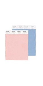
Pantone picks 2016 colour of the year—and there’s two of them this time
by jacquie_dealmeida | December 4, 2015 10:27 am
 [1]Two colours are better than one, so it would seem.
Rather than its usual selection of the hottest hue of the year, Pantone Color Institute has picked two shades as the go-to colours for designers of all disciplines.
According to Pantone, 2016 will be all about ‘Rose Quartz’ and ‘Serenity,’ a soft blue.
“As consumers seek mindfulness and well-being as an antidote to modern-day stresses, welcoming colours that psychologically fulfil our yearning for reassurance and security are becoming more prominent,” Pantone said in a press release.
“Joined together, Rose Quartz and Serenity demonstrate an inherent balance between a warmer, embracing rose tone and the cooler, tranquil blue, reflecting connection and wellness, as well as a soothing sense of order and peace.”
The Pantone colour report provides jewellers with insight on what stones and styles will strike a chord with consumers.
“In many parts of the world, we are experiencing a gender blur as it relates to fashion, which has in turn, impacted colour trends throughout all other areas of design,” Pantone says. “This more unilateral approach to colour is coinciding with societal movements toward gender equality and fluidity, the consumer’s increased comfort with using colour as a form of expression, a generation that has less concern about being typecast or judged, and an open exchange of digital information that has opened our eyes to different approaches to colour usage.”
- [Image]: http://www.jewellerybusiness.com/wp-content/uploads/2015/12/pantone-main.jpg
Source URL: https://www.jewellerybusiness.com/news/pantone-picks-2016-colour-of-the-year-and-theres-two-of-them-this-time/